How to Document a Component in Storybook
Storybook is an open-source frontend development tool that allows you to build and test user interface components in isolation, outside of the main application. It streamlines the development, documentation, and testing of components in an organized and efficient way.
Storybook is primarily composed of components and story files. Each UI component—such as a button or an input—has an associated file with the .stories.tsx extension, where its stories are defined. These stories are simply different variations of the same component. They use args, which are the props passed to the component, allowing you to interactively modify its behavior through the Storybook interface.
Inside that file, you also define a title that organizes the component within the Storybook sidebar—for example, "Form/Inputs/Button". Optionally, you can use decorators to wrap stories with contexts such as themes or providers, customizing their environment. Additionally, you can globally configure Storybook through a file called preview.ts, where you can adjust settings like layout, actions, or design.
Storybook also supports automatic documentation generation when using TypeScript and tags like tags: ['autodocs']. This enables interactive and visual documentation for each component.
For Osborn, Storybook is considered the main tool for documenting and testing components, ensuring consistency with their layout in Figma.
To achieve this, stories must be created under a structured framework. As mentioned earlier, story files must follow the *.stories.tsx naming convention. For example: button.stories.tsx. However, naming alone is not enough; stories must also be organized into a folder structure that reflects the component categorization used in Figma. This structure will serve as the basis for documenting components in Storybook, aligned with the structure defined in the "Project Characteristics" chapter.
├── stories/                        # Stories
│   ├── components/
│   │   ├── button.stories.tsx
│   │   └── card.stories.tsx
│   ├── domains/
│   │   ├── auth/
│   │   │   └── login-form.stories.tsx
│   │   └── users/
│   │       └── user-card.stories.tsx
There are two types of folder organization depending on how components are defined in Figma.
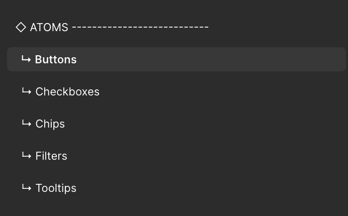
The first case involves shared components, which are defined in Figma pages that only specify the component type—for example: “Atoms > Buttons”. This means the component is reusable across multiple contexts and should therefore be stored under the /stories/components folder.
Page Title: TYPE (◇Atoms - ◇◇Molecules - ◇◇◇Organisms - ❖❖❖ COMPONENTS)
↳ Page Title: Component Group
  ↳ Page Title: Component Name  / Spec 1 / Spec 2
Figma example of the first case:
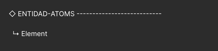
In the second case, if the Figma page includes the entity first (e.g., “Users”) and then the component type, this means the component belongs to a specific domain or context within the project. In such cases, the story should be placed in the corresponding domain folder.
Page Title: ENTITY + TYPE (◇Atoms - ◇◇Molecules - ◇◇◇Organisms - ❖❖❖ COMPONENTS)
↳ Page Title: Component Group
  ↳ Page Title: Component Name  / Spec 1 / Spec 2
Figma example of the second case:
In this context, the term “Spec” (specification) refers to variations of the same component. For example, a Button may have different functional variants, such as a slider control button or a button to increment/decrement a value. Although they are all buttons, their functions differ. Depending on their specificity, they should be organized in the folder that reflects their purpose. Additionally, the section name should include the entity the component belongs to along with its type.
The defined folder structure for stories must strictly follow the same rules as the project’s overall structure. This ensures consistency, facilitates code navigation, and improves both readability and maintainability. For this reason, stories must be located within the same entity or domain as the components they reference.